

Full Service
Plans
Comprehensive roadmap execution from infrastructure to identity.
Explore PlansEnterprise SaaS
Dashboard numbers that finally add up.
We made task dashboards count what they say they count, and made the lists, boards, and cards load fast.
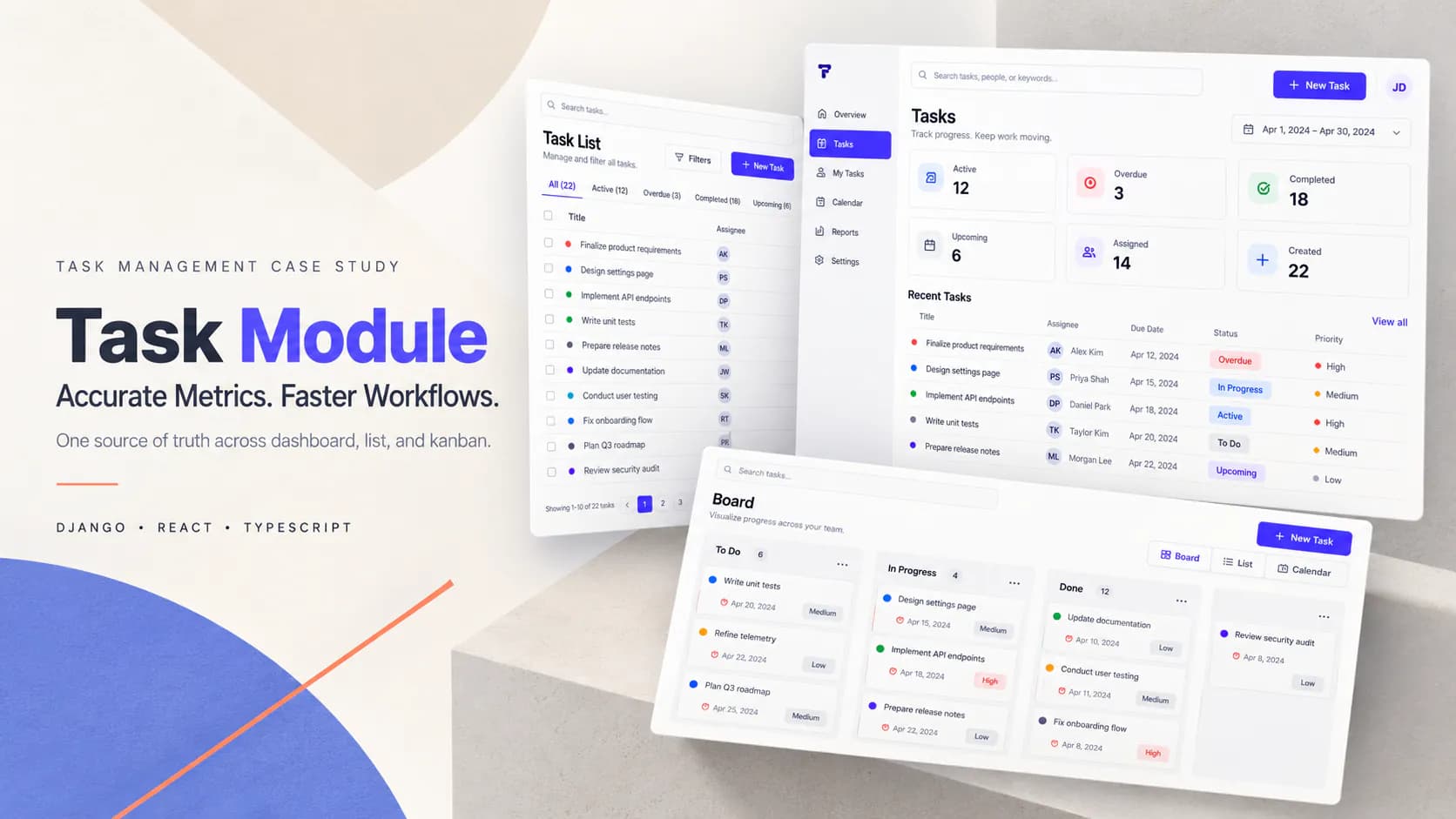
This project fixed the accuracy and performance of a task-management module used daily for planning. Teams open a dashboard each morning to see what is active, overdue and upcoming. Those numbers have to be right. The list and board views also have to load quickly with thousands of tasks in play.
The home dashboard summary cards showed counts nobody could trust. Badges on the cards didn't match the items shown inside them. Users had to guess which number was real. It was unclear whether active, overdue, upcoming, completed, assigned and created counts even followed the same rules. Comparing them was meaningless. Due dates displayed incorrectly because of unsafe date construction in the front end. That produced day-shift and timezone drift. Overdue and status logic lived in several places at once so the same task could look different depending on where you viewed it. Performance was just as bad. Task lists returned all tasks at once with no pagination. Dashboard responses used full task-detail serialisation for small summary cards. Kanban boards serialised entire nested task details for each column. That meant comments, status history, attachments, skills and assignees. The home endpoint ran multiple separate count queries where one aggregation would do. And the inclusion and exclusion rules for project-type tasks were never documented. Nobody could say with confidence what a given number was actually measuring.
We rebuilt the counting layer around one set of shared rules. The summary cards and the visible task lists draw from the same base query so a badge and its contents always agree. Counts for each state are calculated on the server from one definition. Overdue and status logic was standardised into a single backend source of truth. Due dates are serialised consistently and the front end displays them without timezone or local-midnight drift. On performance we introduced lightweight serialisers matched to each context. A small payload for dashboard cards. Another for list views. Another for kanban boards. Full serialisation stays only on the task detail page where comments, history and attachments are genuinely needed. Server-side pagination was added for large lists. Count aggregation was optimised to cut repeated database queries. Optional short-lived caching was added where real-time precision isn't required. We also wrote down what each dashboard metric includes and excludes. The definitions sit in a document now rather than in someone's head.
Our role was to make the module trustworthy and fast without touching its core task behaviour. The client wanted that behaviour preserved. We started by defining what 'accurate' actually meant. The real disagreement was about definitions rather than code. That definition became acceptance criteria before we wrote anything. We then moved display-critical logic out of the front end and into the backend so there was one source of truth rather than several recomputations. Performance work followed the same discipline. Instead of optimising queries in place we matched the weight of each serialiser to the view that uses it. All existing tenant, member, role and task-type rules were preserved. We added regression checks so performance changes couldn't silently break task detail or assignment flows.
Backend: Django, Django REST Framework, TaskViewSet, home-view API, kanban API. Frontend: React, TypeScript. Data models: Task, comments, status history, attachments, skills, assignees. Performance: pagination, lightweight serialisers, query optimisation, optional caching.
Teams can trust the dashboard again because badges and lists draw from the same dataset with the same meaning. The confusing gap between what a badge said and what the list showed is gone. Due dates display correctly and consistently with no timezone or midnight-parsing drift. Overdue indicators behave the same way anywhere you look because they come from one place. Dashboard, list and kanban views load noticeably faster thanks to lightweight serialisers and a single small dashboard request. Large task lists stay responsive at scale through server-side pagination. Database overhead dropped because redundant count queries were consolidated and aggregation optimised. All existing tenant, member, role and task-type rules were preserved and detail pages kept their full data. Clear acceptance criteria, regression checks and written metric definitions mean future performance work will not silently break something else. Teams share the same understanding of what each number means.
Project at a Glance

Hivebuy streamlines procurement workflows from request through approval, bringing clarity and efficiency to every purchasing decision.

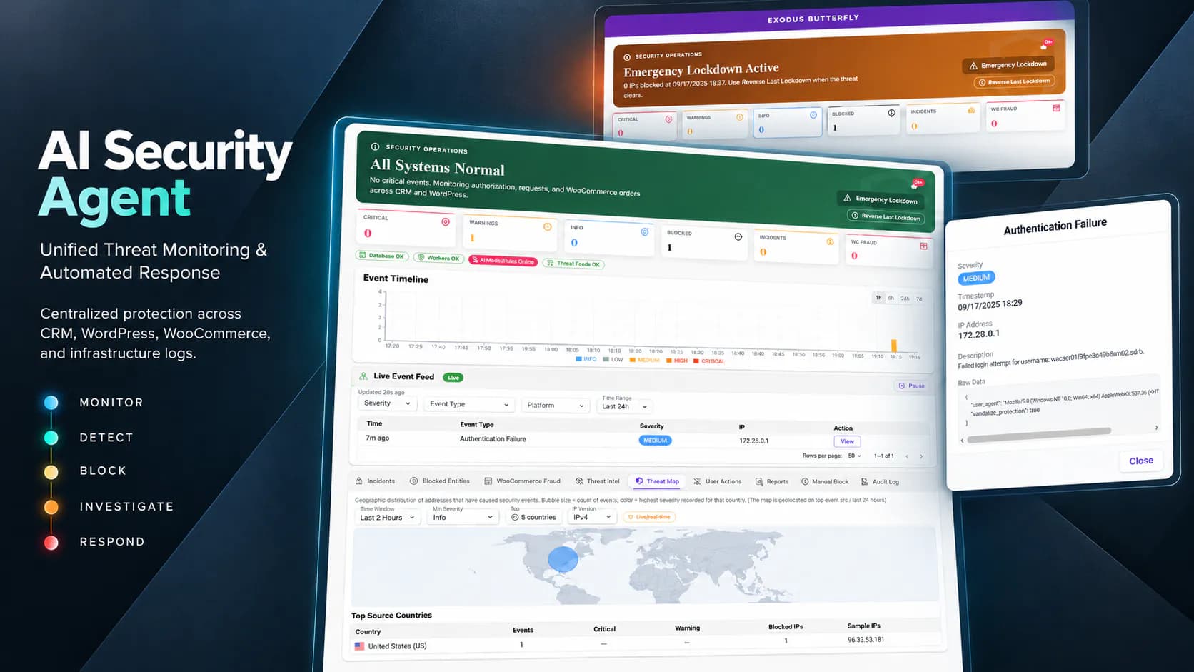
One security brain that watches your CRM, WordPress, and WooCommerce in real time — detecting attacks, scoring fraud, and blocking bad actors everywhere at once.

One reporting layer that pulls every dashboard data source into date-filtered PDF and CSV exports you can generate by simply asking an AI assistant.